Shopping Cart Review

1 of 200+ touchpoints with verbal or written UX and UI feedback over one 6-month per period.
5 issues were flagged in categories of usability, accessibility, and user satisfaction in this review.
1 - 2 day turnaround time or in keeping with engineering deadlines.
Note:
This case study is a closer look at a recurring task, and specifically design feedback given in Figma. Branding and features have been redacted or changed to protect the client's intellectual property and show design thinking process.
Problem
My Role
I led ux strategy, prototyping, ux research and feedback on the product team tasked with managing a migration from a React JS application to a Flutter application over a 6-month period where I provided close to 200+ touchpoints for feedback to designers and engineers on the off-shore development and US/EU based product owners to better align wireframes and prototypes with user and business goals. I was present during weekly pod, sprint, and ad-hoc meetings as needed, where I would give feedback verbally or in a Figma document.
🕒 In formal reviews such as the one described in this case study, I would aim for a 1-2 day turnaround time or in keeping with engineering deadlines.
Setting Up The Figma Document
Design software like Figma offers opportunities for teams to align on goals, and I recommend relevant steps that are appropriate for the insight the team is looking to gain.


Close up of screens included in an interaction flow
Documenting Current Systems: I recommend that teams document current screens because it makes it easy for teams to collaborate. Product teams can annotate, and flag issues with precision. I document systems by building out an interaction flow that mimics the current process either through screen captures or using existing wireframes.
Verifying Information: To identify missing information in the check out process, I performed a comprehensive line-by-line crosscheck to make sure the details were correct. Opening the Figma document in the desktop app and my browser allowed me to quickly run through each section. As a result of this crosscheck, I was able to identify two areas that had missing data. Not flagging these failings would result in critical failures in user check out completion.
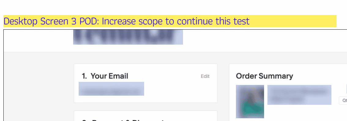
Putting Stakeholders in the Driver’s Seat: I offered an option to increase scope of deliverable. If they felt that more time was needed on this deliverable, they could ask for further investigation. Posing the question makes the stakeholder aware of other possible issues in the shopping cart experience, even if no action is taken at the time of the question.
Before a component goes out the door, I will run various checks to make sure it functions as expected. In this instance, I’m checking to see how this answer box responds to multiple lines of text.

Communication to Manage Scope
User Considerations
The best feedback comes from someone who is passionate and knowledgeable about the users using the product. Asking questions that uncover user needs can help in bridge the gap in understanding for new team members.

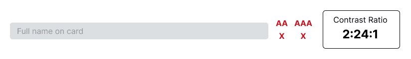
Example of WCAG Failure, see report in permalink.
Delivering the Review
I focus on constructive feedback that is well-reasoned and builds trust.

Screenshot of annotated prototype example
Feedback Style: I look to be a good teammate first and foremost by acknowledging the brainpower that has been invested in solving a problem. I believe this is important for building trust, and strengthening teams. I take the person giving me the deliverable into account, and what is possible as well, so the feedback I give is appropriate. I aim for respectful feedback that is direct, and relevant.
Annotating Mock Ups for Clarity: Once frames have been documented, I will use rectangles in visible colors to identify problem areas with text that clearly explains the issue. I will also make use of the Figma comment tool, depending on the audience. I make it possible for anyone looking at the document to understand key problem areas to discuss in meetings.
Providing Constructive Feedback: I look to frame feedback as suggestions (not demands). I think it goes a long way to build trust, and also making sure the product aligns with user needs. The critical aspects of my feedback come from my understanding of user needs at the time of the review. I’m direct with these insights, so it is clear where I stand on certain issues regarding the user experience.
Impact of UX Reviews
In this review, I caught 2 Critical Errors, 1 Workflow Error, 1 Accessibility Error. Also, I identified 1 opportunity to increase user satisfaction. These errors affect all prospective customers globally to one degree or another, empowering team members by giving them the information and language necessary to make these vital changes. But also, keeping communication lines open in case there are follow up questions, or further reviews required on this topic in the future.
© 2020 - 2024 Mark Singer
All rights reserved.
Version: 2.0
Version Release Date: 10/01/24