case study
Femmar Design System
Problem
A large range of webpages required systemic changes to navigational elements and layout. The product team needed to build CMS and hard-coded pages in Figma that could be easily distributed to engineering and executive teams.
My Role
I was brought on to scale design efforts as the sole UX Designer embedded on the product team with an Operations Executive and Product Manager. I recommended that we build a Design System in tandem with Wireframes so we could scale efforts, build only what was necessary, and quickly iterate on ideas. This would save time on short runways, and yield over a dozen page styles in the span of three months.
Building a Design System in Figma
200+ micro elements were built over three months to assist with prototype build.
In a new Figma file, I set up pages where stakeholders, engineers, and myself (i.e. designers) could find what they needed quickly. In response to deadlines, I built the Design System alongside developing wireframes, getting approval for components, as we went. I believed this was the best approach because it gave stakeholders the confidence that things were being built, while also enabling us to scale efforts on content pages. Using a Design System reduced the risk of developing identical/similar components or developing the wrong thing. As a result, 100% of live environment webpages were the result of the Design System.
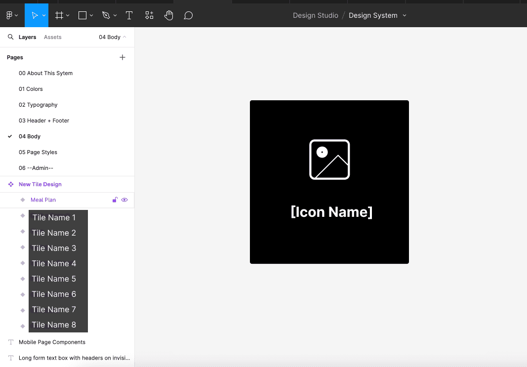
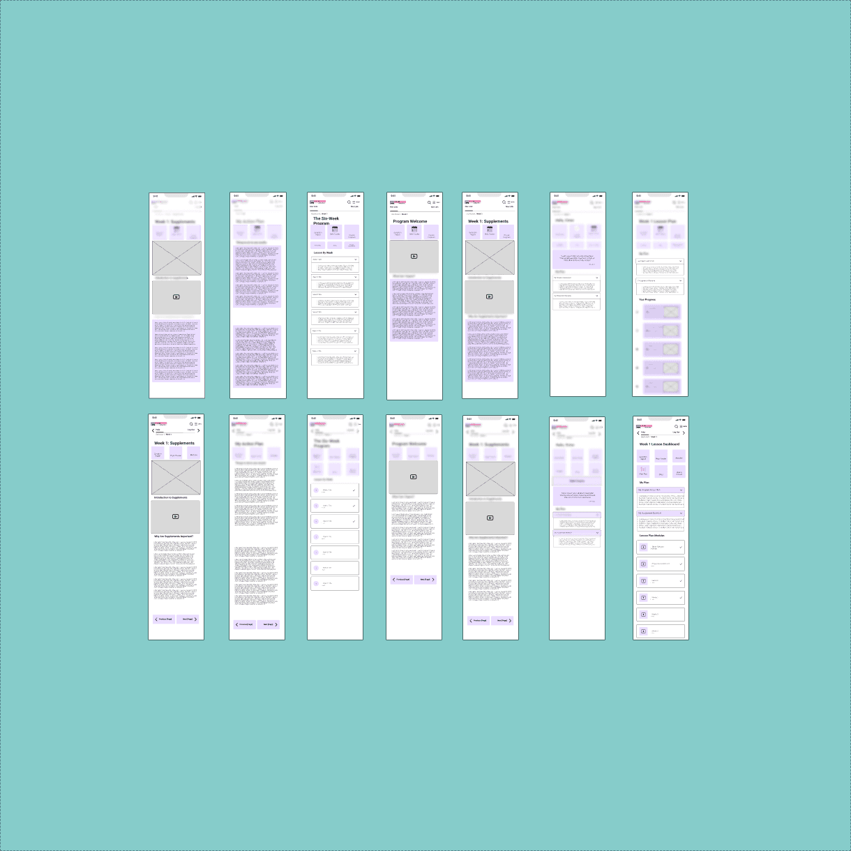
Image: View of file organization and asset sample (redacted)
Due to the nature of the project, some components couldn’t be found in a pre-existing Design System like Material. I proposed a semi-custom design system solution, which would allow us to take atoms, and molecules from existing DS from an approved list, and make them their own.
One such example is a questionnaire component, which were made up on atomic level components from Decathlon's Design System Vitamin, a favorite amongst the stakeholder team.

Image: View of Components from Vitamin, Semi-Custom and Custom Components
Another aspect of building a new design system is error handling and functionality testing.
To test functionality, I will usually create a Sample Asset area in order to see if it works as expected or send to a Stakeholder for testing.
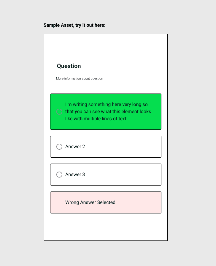
Image: Sample Asset Created for Functionality Testing
Before a component goes out the door, I will run various checks to make sure it functions as expected. In this instance, I’m checking to see how this answer box responds to multiple lines of text.
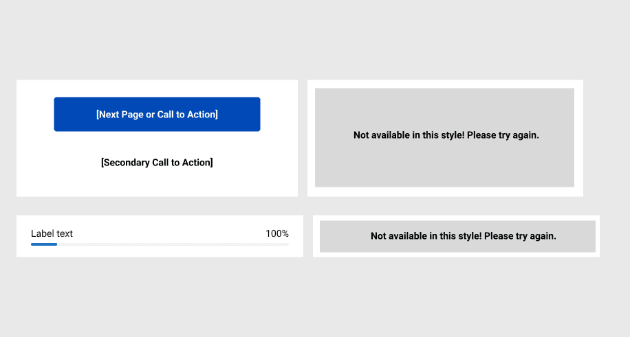
Image: Error Handling and Testing with New Component
If team members selected an invalid combination when building out a new page, they would receive the messages on the right. This would allow a designer to troubleshoot issues more quickly, and provide guidance on how to use these components and build designs of their own.
Training Teams
Designers would be responsible for molecular, atomic, and organism level changes to the design system. Designers also might field customization requests, when specific functionality was required. Product team members with less technical skill level would be tasked with building out page styles. I demonstrated the process on the call, and maintained high-touch service as they built out pages. Limiting task scope made it possible for these team members to succeed:

Image / GIF: Simulation of User Using Asset Menu to Select a Page Style
Engineers could look at design specifications in dev mode, and I provided help articles for engineers who were new to Figma, or field questions on sprint calls.
Ad-Hoc Requests and Maintenance
Ad hoc design request fulfilled weekly
After the initial system was built, additional features were added to the product. Hosting the Design System in Figma allowed us to make changes across team files, and put product owners in the driver seat of when they wanted to download updates, so they felt empowered and aware of all changes made to the system. Such an interaction followed the following user flow:
Request of change submitted in meeting or Slack by stakeholder > Designer receives request order and makes change in Figma during studio hours > Designer publishes Change in Figma > Stakeholder updates component in asset panel at their convenience
I made a habit of reviewing frames built by stakeholders, and make necessary adjustments in order to align closer with the Design System, and keep frames to spec, to ensure quality of product.
Into Production
Seeing the navigational and content screens in testing and live environments was exciting because the product became clear and consistent. There was pride, knowing that the product team created the specs for engineers to do their magic.
Note: Branding and features have been redacted or changed to protect customer's intellectual property. Images are designed to show my design approach.
© 2020 - 2024 Mark Singer
All rights reserved.
Version: 2.0
Version Release Date: 10/01/24